To get that vintage Instagram effect on your pictures, you don't have to use a program, now you can use CSS and get a similar result! The following trick will apply a shadow inside the image, add a back border, and on top of the image, add another semitransparent image with a grunge style that will give a vintage touch.
You can see a demo on the test blog - move the cursor over the image and it changes back to normal (notice that borders remain the same):

Obviously, there will be images that will fit better these effects than others, but regardless of that we do, there should be made a few observations:
- this effect is made with CSS and it will not recognize some browsers, especially Internet Explorer. So this effect might not work on older versions of IE.
- the images are not centered, you will have to align them to the left (default) or to the right.
Now let's add the CSS code for applying this vintage Instagram effect on our images.

Step 2. Click anywhere inside the code area and press the CTRL + F keys to open Blogger' search box
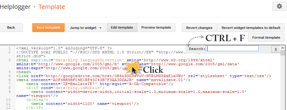
Step 3. Type or paste the following tag inside the search box:
Step 6. Finally, add the following HTML code inside the HTML section of your posts each time you want to apply the vintage effect to an image:
And that's it, with this little experiment you can have your vintage-style images using CSS only.
You can see a demo on the test blog - move the cursor over the image and it changes back to normal (notice that borders remain the same):
Obviously, there will be images that will fit better these effects than others, but regardless of that we do, there should be made a few observations:
- this effect is made with CSS and it will not recognize some browsers, especially Internet Explorer. So this effect might not work on older versions of IE.
- the images are not centered, you will have to align them to the left (default) or to the right.
Now let's add the CSS code for applying this vintage Instagram effect on our images.
Adding Instagram-like Vintage Effect to Blogger Images
Step 1. From your Blogger dashboard > go to "Template" > "Edit HTML"Step 2. Click anywhere inside the code area and press the CTRL + F keys to open Blogger' search box
Step 3. Type or paste the following tag inside the search box:
</head>Step 4. Just above </head> add the following CSS style:
<style>Note: The line in bold that corresponds to the color of the image, can be changed to any other color; here are some examples of traditional vintage:
.vintage img {
padding:0;
float:left;
}
.vintage {
border:10px solid #000;
position: relative;
float: left; /* Change to right if you want the images to be aligned to the right */
margin-right: 20px;
margin-bottom: 20px;
}
.vintage:before {
content: "";
display: block;
position: absolute;
top: 0;
bottom: 0;
left: 0;
right: 0;
background-color: rgba(255,102,0, 0.6); /* sepia */
background-image:url(https://blogger.googleusercontent.com/img/b/R29vZ2xl/AVvXsEhMVaycNl4jd3n5QbHuycrJgsKTCGHWXoxQ7P26De4n72o49wCWzNd99UkaHXmFQm2dXtzj1eEB8ukCdS96EkFk6ITLTwoGbBf8ZGLWk86h14QrQAOCGn_FmXJUuW6W8KGx7bFBEBab_t4/s0/grunge.png);
background-size: cover;
box-shadow: inset 0 0 50px #000, inset 0 0 50px #000, inset 0 0 50px #000;
-moz-transition: all 1s;
-webkit-transition: all 1s;
-o-transition: all 1s;
transition: all .1s;
}
.vintage:hover:before {
background: none;
box-shadow:none;
-moz-transition: all 1s;
-webkit-transition: all 1s;
-o-transition: all 1s;
transition: all .1s;
}
</style>
background-color: rgba(0,0,255, 0.5); /* blue */If you want the image not to change to its original state on mouse hover, then remove the last code:
background-color: rgba(0,255,0, 0.5); /* green */
background-color: rgba(0,255,255, 0.5); /* cyan */
background-color: rgba(255,0,0, 0.5); /* red */
background-color: rgba(255,0,240, 0.5); /* violet */
.vintage:hover:before {Step 5. Click the "Save Template" button to save the style.
background: none;
box-shadow:none;
-moz-transition: all 1s;
-webkit-transition: all 1s;
-o-transition: all 1s;
transition: all .1s;
}
Step 6. Finally, add the following HTML code inside the HTML section of your posts each time you want to apply the vintage effect to an image:
<div class="vintage" style="clear:both;">Replace the text in blue with the url of your picture.
<img border="0" src="URL of the image" />
</div>
And that's it, with this little experiment you can have your vintage-style images using CSS only.
You are so smart at blogspot. Thank you for your reply on " Missing for a while" entry. I' ll try what you told me soon.
ReplyDeleteI will try the tutorial vintage style to this image, for the installation script I guess it's not that hard. thank you, and I will copy.
ReplyDeletewow this is very nice tuts, but anyway is there is way to customize width and height of image, thanks alot ,m8
ReplyDelete