 In the previous post I have mentioned that we will learn about how to create rounded images using CSS, without needing to edit them one by one using a program. Now that we have seen the basics of CSS, let's try to apply it on some pictures.
What we will do in this tutorial is to upload an image (HTML) and then add some rules in the stylesheet that will transform the outer shape to look like a circle... or, at least, to appear round. This will depend on the proportions of that picture we will use.
In fact, we can apply this effect to any picture, to a specific part of our blog or to all the pictures found in our blog. This depends on your tastes.
Marking up HTML
Obviously, the first thing we need to do in order to set a rounded border around an image is to get a picture and upload it to get the html structure. The code could be a little bit more complicated, but an image is built within the img tag, which basically, looks like this:
<img src="image_URL"/>Screenshot:
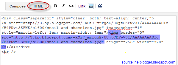

Usually, it might also contain an alt text, and sometimes, may have some predetermined dimensions (with a specific width and/or height). When we upload an image using the Blogger post editor, the code will also have a link pointing to the original image.
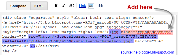
But if we want to modify this image using CSS, we need to add a class selector. We can add it in two ways: within the img tag or in a parent box. The name that I have chosen for the image selector is roundedcorners, however, you can add any name you want:
<img class="roundedcorners" src="image_URL"/>
<div class="roundedcorners">
<img src="image_URL"/>
</div>
Applying style to all homogeneous elements
But that selector alone won't do anything special. It needs to be linked to a style rule telling what to do with it. The same if when we add just classes, if these are not defined within the CSS, the appearance of a picture (or a certain element) will not change.
To change the shape of the all the pictures on our blog, this is what we should add to our CSS:
img {And how this translates to your browser?
border: 2px solid #BADA55;
margin: 0;
padding: 0;
border-radius: 1000px;
-moz-border-radius: 1000px;
}
Search for images by name tag (img) and apply the following style:
- a solid green border of 2 pixels
- set the margins (space outside the border) and padding (space inside the border) to zero
- apply the rounded corner look to all the four corners
 Now that we have this rule in our style sheet itself, we'll be able to see the picture as we want - take a look at the image on the right.
To declare a property correctly, we need to know what it does and how to write it - details which could be found all over the internet, although W3C is the authority in this.
For instance, the border-radius property initially requires four (4) values reading from left to right, which represent the roundness of the upper-left, upper-right, lower-right and lower-left corner. If you add a single value, it will make all the four corners to be equal with that value.
It is important to mention that when the value of the border exceeds the dimensions of the container, this border will create a circle.
How to apply the same style on the elements of the same container
Sometimes, we don't want all the images on our blog to be round, but only the ones that we choose, otherwise adding the style above within the head tag will make all the pictures taking this shape. Before, we used an HTML tag (img) and not a selector and, for this reason, the style will affect all our images.
To avoid this, we can do one of the things we saw at the beginning of this post and that was to place the image inside a div with the roundedcorners class. This way, only the images within the container with that class will be affected by the rule that will make them round.
<div class="roundedcorners"><img src="image_URL"/></div>But the rule then should not affect the img tag directly, but the roundedcorners selector. In this case, you should write it like this:
.roundedcorners img {This implies that this style applies only to images that are within the container with the roundedcorners class.
border: 2px solid #BADA55;
....
}
Final words
To end this tutorial on creating pictures with rounded borders, keep in mind that if these are not square, instead of becoming circular, they will look oval:

To fix this we should add the width and height with the same measure (value in pixels) to force the image cropping and to make it appear perfectly circular. That was all!
If you enjoy reading this blog, please share and subscribe. For any questions, drop a comment below ;)
Thanks for this post .but i want to make only post images rounded by default .I dont want to add css on every post instead can we do something in Blogger Edit Html ,so that all the images in post get circular automatically.
ReplyDeleteCopy the style from "Applying style to all homogeneous elements" and paste it above ]]></b:skin>
DeleteYour post is really interesting...The main point of this blogpost is that you have given the code which we need to implement. i bookmark your website for your future use...can u please share post related to ror development ?
ReplyDeletesegera di terapka master..terima kasih atas share infonya
ReplyDeleteHi I was searching for tutorials on how to make the images on my recent post a "rounded" one and I bump in to your blog.I'm actually having problem with codes.bummer.can you do a tutorial on how to make the photos on recent posts rounded?Please? :( I hope you can help me.You can email me in cjescuadro@gmail.com.Thank you so much!
ReplyDelete