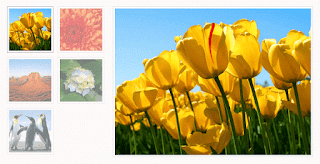
Here is an amazing CSS image effect to reveal more information on your images with a really cool CSS3 hover animation. This is just perfect for blogs dedicated to music or if you just want to show off the music that you love.
So, what we will do in this tutorial is to take an image for our album cover, add some fancy CSS3 transitions and transforms that, on hover, will slide out a pure CSS vinyl record behind it. Finally, we will add some basic HTML to our post or page where we need to apply this amazing effect.

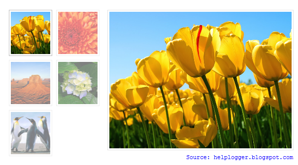
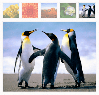
Demo: hover over the album cover and see how CSS reveals further information:
 The Wall is the eleventh studio album by the English progressive rock group Pink Floyd.

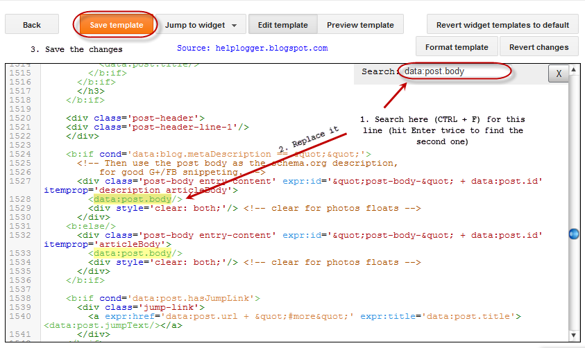
Step 2. Click anywhere inside the code area and press the CTRL + F keys to open the search box:
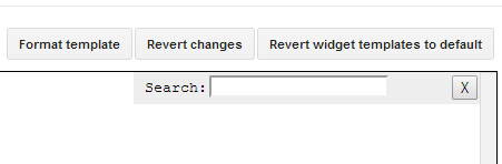 Step 3. Type or paste inside the search box the tag below and hit Enter to find it:
Step 5. Click on the "Save template" button to save the changes.
For applying the animated vinyl record effect on your image, first upload the picture for your album cover, copy the URL of it and then paste it inside a Notepad so that you can use it later. If you don't know how to upload images and get the URLs, please see this tutorial: How to upload images and get the URLs
Step 6. When you create a post, add this code inside the HTML section:
So, what we will do in this tutorial is to take an image for our album cover, add some fancy CSS3 transitions and transforms that, on hover, will slide out a pure CSS vinyl record behind it. Finally, we will add some basic HTML to our post or page where we need to apply this amazing effect.
Demo: hover over the album cover and see how CSS reveals further information:
The Wall is the eleventh studio album by the English progressive rock group Pink Floyd.
How to Apply The Animated Vinyl Record on Blogger Images
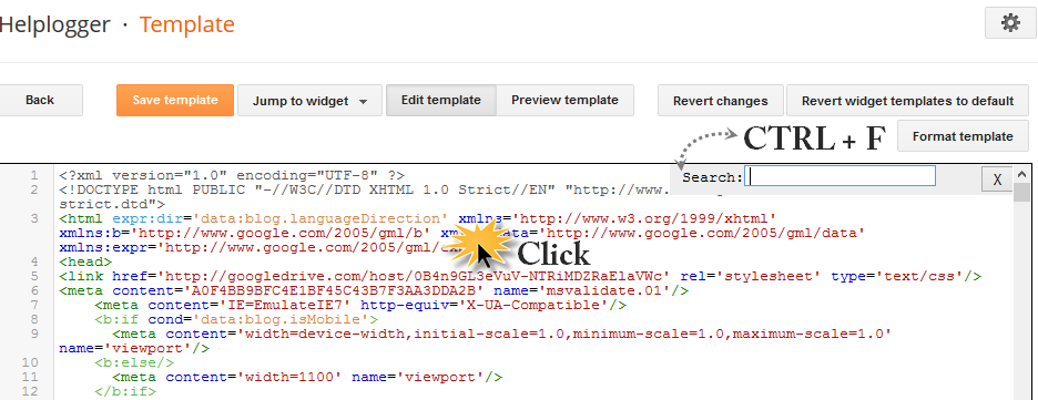
Step 1. From your Blogger's Dashboard, go to "Template" > click on the "Edit HTML" button:Step 2. Click anywhere inside the code area and press the CTRL + F keys to open the search box:
]]></b:skin>Step 4. Just above ]]></b:skin> add the following code:
.info {
position: absolute;
z-index: 3;
top: 20%;
zoom: 1;
filter: alpha(opacity=0);
opacity: 0;
padding: 10px;
text-align: center;
color: #eee;
font-size: 13px;
font-weight: bold;
background: #333;
background: rgba(0,0,0,.7);
-moz-transition:all linear 0.5s 0s;
-webkit-transition:all linear 0.5s 0s;
transition:all ease 0.5s 0s;
}
.case:hover .info, .case:hover .vinyl {
filter: alpha(opacity=100);
opacity:1;
}
.case {
position:relative;
display:block;
width:185px;
height:185px;
-webkit-border-radius:3px;
border-radius:3px;
z-index:2;
-webkit-box-shadow: 0px 0px 2px 0px rgba(0, 0, 0, 0.2);
box-shadow: 0px 0px 2px 0px rgba(0, 0, 0, 0.2);
margin:0 auto;
}
.case:after {
position:absolute;
display:block;
content: "";
width:265px;
height:10px;
left:-40px;
bottom:-8px;
z-index:1;
background: -moz-radial-gradient(center, ellipse cover, rgba(0,0,0,0.45) 0%, rgba(0,0,0,0) 50%, rgba(225,225,225,0) 51%, rgba(246,246,246,0) 100%);
background: -webkit-gradient(radial, center center, 0px, center center, 100%, color-stop(0%,rgba(0,0,0,0.45)), color-stop(50%,rgba(0,0,0,0)), color-stop(51%,rgba(225,225,225,0)), color-stop(100%,rgba(246,246,246,0)));
background: -webkit-radial-gradient(center, ellipse cover, rgba(0,0,0,0.45) 0%,rgba(0,0,0,0) 50%,rgba(225,225,225,0) 51%,rgba(246,246,246,0) 100%);
background: -o-radial-gradient(center, ellipse cover, rgba(0,0,0,0.45) 0%,rgba(0,0,0,0) 50%,rgba(225,225,225,0) 51%,rgba(246,246,246,0) 100%);
background: -ms-radial-gradient(center, ellipse cover, rgba(0,0,0,0.45) 0%,rgba(0,0,0,0) 50%,rgba(225,225,225,0) 51%,rgba(246,246,246,0) 100%);
background: radial-gradient(center, ellipse cover, rgba(0,0,0,0.45) 0%,rgba(0,0,0,0) 50%,rgba(225,225,225,0) 51%,rgba(246,246,246,0) 100%);
}
.case .cover{
position:absolute;
top:0;
left:0;
width:100%;
height:100%;
z-index:2;
-webkit-border-radius:3px;
border-radius:3px;
-webkit-box-shadow: 2px 0px 2px 0px rgba(0, 0, 0, 0.6);
box-shadow: 2px 0px 2px 0px rgba(0, 0, 0, 0.6);
}
.case .overlay{
position:absolute;
display:block;
top:0;
left:0;
z-index:3;
width:100%;
height:100%;
-webkit-box-shadow: inset 1px 1px 4px 0px rgba(255, 255, 255, 0.45),inset 1px 1px 2px 0px rgba(255,255, 255, 0.5),inset -1px -1px 2px 0px rgba(255,255, 255, 0.5);
box-shadow: inset 1px 1px 4px 0px rgba(255,255, 255, 0.45),inset 1px 1px 2px 0px rgba(255,255, 255, 0.5),inset -1px -1px 2px 0px rgba(255,255, 255, 0.5);
-webkit-border-radius:3px;
border-radius:3px;
border:1px solid rgba(0, 0, 0, 0.35);
}
.case .overlay:before{
position:absolute;
display:block;
content: "";
top:0;
left:0;
z-index:4;
width:100%;
height:100%;
background: -moz-linear-gradient(-55deg, rgba(255,255,255,0.1) 0%, rgba(244,244,244,0.35) 50%, rgba(225,225,225,0) 51%, rgba(246,246,246,0) 100%); /* FF3.6+ */
background: -webkit-gradient(linear, left top, right bottom, color-stop(0%,rgba(255,255,255,0.1)), color-stop(50%,rgba(244,244,244,0.35)), color-stop(51%,rgba(225,225,225,0)), color-stop(100%,rgba(246,246,246,0))); /* Chrome,Safari4+ */
background: -webkit-linear-gradient(-45deg, rgba(255,255,255,0.1) 0%,rgba(244,244,244,0.35) 50%,rgba(225,225,225,0) 51%,rgba(246,246,246,0) 100%); /* Chrome10+,Safari5.1+ */
background: -o-linear-gradient(-45deg, rgba(255,255,255,0.1) 0%,rgba(244,244,244,0.35) 50%,rgba(225,225,225,0) 51%,rgba(246,246,246,0) 100%); /* Opera 11.10+ */
background: -ms-linear-gradient(-45deg, rgba(255,255,255,0.1) 0%,rgba(244,244,244,0.35) 50%,rgba(225,225,225,0) 51%,rgba(246,246,246,0) 100%); /* IE10+ */
background: linear-gradient(-55deg, rgba(255,255,255,0.1) 0%,rgba(244,244,244,0.35) 50%,rgba(225,225,225,0) 51%,rgba(246,246,246,0) 100%); /* W3C */
-webkit-border-radius:3px;
border-radius:3px;
}
.vinyl {
position:absolute;
z-index:1;
bottom:4px;
left:5px;
display:block;
width:175px;
height:175px;
border-radius:200px;
background: -moz-linear-gradient(top, rgba(45,45,45,1) 0%, rgba(0,0,0,1) 100%);
background: -webkit-gradient(linear, left top, left bottom, color-stop(0%,rgba(45,45,45,1)), color-stop(100%,rgba(0,0,0,1)));
background: -webkit-linear-gradient(top, rgba(45,45,45,1) 0%,rgba(0,0,0,1) 100%);
background: -o-linear-gradient(top, rgba(45,45,45,1) 0%,rgba(0,0,0,1) 100%);
background: -ms-linear-gradient(top, rgba(45,45,45,1) 0%,rgba(0,0,0,1) 100%);
background: linear-gradient(top, rgba(45,45,45,1) 0%,rgba(0,0,0,1) 100%);
-webkit-box-shadow: inset 0px 1px 3px 0px rgba(255, 255, 255, 1);
box-shadow: inset 0px 1px 0px 0px rgba(255, 255, 255, 0.35), inset 0px -1px 1px 0px rgba(255, 255, 255, 0.25), 0px 0px 8px 0px rgba(0, 0, 0, 0.4);
border:1px solid #595959;
transition: all 500ms ease-in-out;
-moz-transition: all 500ms ease-in-out;
-webkit-transition: all 500ms ease-in-out;
-o-transition: all 500ms ease-in-out;
}
.case:hover .vinyl {
animation: spin 600ms ease-in-out;
-moz-animation: spin 600ms ease-in-out;
-webkit-animation: spin 600ms ease-in-out;
left:98px;
}
.vinyl:before {
position:absolute;
display:block;
content: "";
width:100%;
height:100%;
border-radius:100%;
background: -moz-radial-gradient(center, ellipse cover, rgba(38,38,38,0.4) 0%, rgba(89,89,89,0.4) 1%, rgba(35,35,35,0.4) 2%, rgba(86,86,86,0.4) 3%, rgba(35,35,35,0.4) 4%, rgba(86,86,86,0.4) 5%, rgba(35,35,35,0.4) 6%, rgba(86,86,86,0.4) 7%, rgba(35,35,35,0.4) 8%, rgba(86,86,86,0.4) 9%, rgba(35,35,35,0.4) 10%, rgba(86,86,86,0.4) 11%, rgba(35,35,35,0.4) 12%, rgba(86,86,86,0.4) 13%, rgba(35,35,35,0.4) 14%, rgba(86,86,86,0.4) 15%, rgba(35,35,35,0.4) 16%, rgba(86,86,86,0.4) 17%, rgba(35,35,35,0.4) 18%, rgba(86,86,86,0.4) 19%, rgba(35,35,35,0.4) 20%, rgba(86,86,86,0.4) 21%, rgba(35,35,35,0.4) 22%, rgba(86,86,86,0.4) 23%, rgba(35,35,35,0.4) 24%, rgba(86,86,86,0.4) 25%, rgba(35,35,35,0.4) 26%, rgba(86,86,86,0.4) 27%, rgba(35,35,35,0.4) 28%, rgba(86,86,86,0.4) 29%, rgba(35,35,35,0.4) 30%, rgba(86,86,86,0.4) 31%, rgba(35,35,35,0.4) 32%, rgba(86,86,86,0.4) 33%, rgba(35,35,35,0.4) 34%, rgba(86,86,86,0.4) 35%, rgba(35,35,35,0.4) 36%, rgba(86,86,86,0.4) 37%, rgba(35,35,35,0.4) 38%, rgba(86,86,86,0.4) 39%, rgba(35,35,35,0.4) 40%, rgba(86,86,86,0.4) 41%, rgba(35,35,35,0.4) 42%, rgba(86,86,86,0.4) 43%, rgba(35,35,35,0.4) 44%, rgba(86,86,86,0.4) 45%, rgba(35,35,35,0.4) 46%, rgba(86,86,86,0.4) 47%, rgba(35,35,35,0.4) 48%, rgba(86,86,86,0.4) 49%, rgba(35,35,35,0.4) 50%, rgba(86,86,86,0.4) 51%, rgba(35,35,35,0.4) 52%, rgba(86,86,86,0.4) 53%, rgba(35,35,35,0.4) 54%, rgba(86,86,86,0.4) 55%, rgba(35,35,35,0.4) 56%, rgba(86,86,86,0.4) 57%, rgba(35,35,35,0.4) 58%, rgba(86,86,86,0.4) 59%, rgba(35,35,35,0.4) 60%, rgba(86,86,86,0.4) 61%, rgba(35,35,35,0.4) 62%, rgba(86,86,86,0.4) 63%, rgba(35,35,35,0.4) 64%, rgba(86,86,86,0.4) 65%, rgba(35,35,35,0.4) 66%, rgba(86,86,86,0.4) 67%, rgba(35,35,35,0.4) 68%, rgba(86,86,86,0.4) 69%, rgba(35,35,35,0.4) 70%, rgba(86,86,86,0.4) 71%, rgba(35,35,35,0.4) 72%, rgba(86,86,86,0.4) 73%, rgba(35,35,35,0.4) 74%, rgba(86,86,86,0.4) 75%, rgba(35,35,35,0.4) 76%, rgba(86,86,86,0.4) 77%, rgba(35,35,35,0.4) 78%, rgba(86,86,86,0.4) 79%, rgba(35,35,35,0.4) 80%, rgba(86,86,86,0.4) 81%, rgba(35,35,35,0.4) 82%, rgba(86,86,86,0.4) 83%, rgba(35,35,35,0.4) 84%, rgba(86,86,86,0.4) 85%, rgba(35,35,35,0.4) 86%, rgba(86,86,86,0.4) 87%, rgba(35,35,35,0.4) 88%, rgba(86,86,86,0.4) 89%, rgba(35,35,35,0.4) 90%, rgba(86,86,86,0.4) 91%, rgba(35,35,35,0.4) 92%, rgba(86,86,86,0.4) 93%, rgba(35,35,35,0.4) 94%, rgba(86,86,86,0.4) 95%, rgba(35,35,35,0.4) 96%, rgba(86,86,86,0.4) 97%, rgba(86,86,86,0.4) 97%, rgba(35,35,35,0.4) 98%);
background: -webkit-gradient(radial, center center, 0px, center center, 100%, color-stop(0%,rgba(38,38,38,0.4)), color-stop(1%,rgba(89,89,89,0.4)), color-stop(2%,rgba(35,35,35,0.4)), color-stop(3%,rgba(86,86,86,0.4)), color-stop(4%,rgba(35,35,35,0.4)), color-stop(5%,rgba(86,86,86,0.4)), color-stop(6%,rgba(35,35,35,0.4)), color-stop(7%,rgba(86,86,86,0.4)), color-stop(8%,rgba(35,35,35,0.4)), color-stop(9%,rgba(86,86,86,0.4)), color-stop(10%,rgba(35,35,35,0.4)), color-stop(11%,rgba(86,86,86,0.4)), color-stop(12%,rgba(35,35,35,0.4)), color-stop(13%,rgba(86,86,86,0.4)), color-stop(14%,rgba(35,35,35,0.4)), color-stop(15%,rgba(86,86,86,0.4)), color-stop(16%,rgba(35,35,35,0.4)), color-stop(17%,rgba(86,86,86,0.4)), color-stop(18%,rgba(35,35,35,0.4)), color-stop(19%,rgba(86,86,86,0.4)), color-stop(20%,rgba(35,35,35,0.4)), color-stop(21%,rgba(86,86,86,0.4)), color-stop(22%,rgba(35,35,35,0.4)), color-stop(23%,rgba(86,86,86,0.4)), color-stop(24%,rgba(35,35,35,0.4)), color-stop(25%,rgba(86,86,86,0.4)), color-stop(26%,rgba(35,35,35,0.4)), color-stop(27%,rgba(86,86,86,0.4)), color-stop(28%,rgba(35,35,35,0.4)), color-stop(29%,rgba(86,86,86,0.4)), color-stop(30%,rgba(35,35,35,0.4)), color-stop(31%,rgba(86,86,86,0.4)), color-stop(32%,rgba(35,35,35,0.4)), color-stop(33%,rgba(86,86,86,0.4)), color-stop(34%,rgba(35,35,35,0.4)), color-stop(35%,rgba(86,86,86,0.4)), color-stop(36%,rgba(35,35,35,0.4)), color-stop(37%,rgba(86,86,86,0.4)), color-stop(38%,rgba(35,35,35,0.4)), color-stop(39%,rgba(86,86,86,0.4)), color-stop(40%,rgba(35,35,35,0.4)), color-stop(41%,rgba(86,86,86,0.4)), color-stop(42%,rgba(35,35,35,0.4)), color-stop(43%,rgba(86,86,86,0.4)), color-stop(44%,rgba(35,35,35,0.4)), color-stop(45%,rgba(86,86,86,0.4)), color-stop(46%,rgba(35,35,35,0.4)), color-stop(47%,rgba(86,86,86,0.4)), color-stop(48%,rgba(35,35,35,0.4)), color-stop(49%,rgba(86,86,86,0.4)), color-stop(50%,rgba(35,35,35,0.4)), color-stop(51%,rgba(86,86,86,0.4)), color-stop(52%,rgba(35,35,35,0.4)), color-stop(53%,rgba(86,86,86,0.4)), color-stop(54%,rgba(35,35,35,0.4)), color-stop(55%,rgba(86,86,86,0.4)), color-stop(56%,rgba(35,35,35,0.4)), color-stop(57%,rgba(86,86,86,0.4)), color-stop(58%,rgba(35,35,35,0.4)), color-stop(59%,rgba(86,86,86,0.4)), color-stop(60%,rgba(35,35,35,0.4)), color-stop(61%,rgba(86,86,86,0.4)), color-stop(62%,rgba(35,35,35,0.4)), color-stop(63%,rgba(86,86,86,0.4)), color-stop(64%,rgba(35,35,35,0.4)), color-stop(65%,rgba(86,86,86,0.4)), color-stop(66%,rgba(35,35,35,0.4)), color-stop(67%,rgba(86,86,86,0.4)), color-stop(68%,rgba(35,35,35,0.4)), color-stop(69%,rgba(86,86,86,0.4)), color-stop(70%,rgba(35,35,35,0.4)), color-stop(71%,rgba(86,86,86,0.4)), color-stop(72%,rgba(35,35,35,0.4)), color-stop(73%,rgba(86,86,86,0.4)), color-stop(74%,rgba(35,35,35,0.4)), color-stop(75%,rgba(86,86,86,0.4)), color-stop(76%,rgba(35,35,35,0.4)), color-stop(77%,rgba(86,86,86,0.4)), color-stop(78%,rgba(35,35,35,0.4)), color-stop(79%,rgba(86,86,86,0.4)), color-stop(80%,rgba(35,35,35,0.4)), color-stop(81%,rgba(86,86,86,0.4)), color-stop(82%,rgba(35,35,35,0.4)), color-stop(83%,rgba(86,86,86,0.4)), color-stop(84%,rgba(35,35,35,0.4)), color-stop(85%,rgba(86,86,86,0.4)), color-stop(86%,rgba(35,35,35,0.4)), color-stop(87%,rgba(86,86,86,0.4)), color-stop(88%,rgba(35,35,35,0.4)), color-stop(89%,rgba(86,86,86,0.4)), color-stop(90%,rgba(35,35,35,0.4)), color-stop(91%,rgba(86,86,86,0.4)), color-stop(92%,rgba(35,35,35,0.4)), color-stop(93%,rgba(86,86,86,0.4)), color-stop(94%,rgba(35,35,35,0.4)), color-stop(95%,rgba(86,86,86,0.4)), color-stop(96%,rgba(35,35,35,0.4)), color-stop(97%,rgba(86,86,86,0.4)), color-stop(97%,rgba(86,86,86,0.4)), color-stop(98%,rgba(35,35,35,0.4)));
background: -webkit-radial-gradient(center, ellipse cover, rgba(38,38,38,0.4) 0%,rgba(89,89,89,0.4) 1%,rgba(35,35,35,0.4) 2%,rgba(86,86,86,0.4) 3%,rgba(35,35,35,0.4) 4%,rgba(86,86,86,0.4) 5%,rgba(35,35,35,0.4) 6%,rgba(86,86,86,0.4) 7%,rgba(35,35,35,0.4) 8%,rgba(86,86,86,0.4) 9%,rgba(35,35,35,0.4) 10%,rgba(86,86,86,0.4) 11%,rgba(35,35,35,0.4) 12%,rgba(86,86,86,0.4) 13%,rgba(35,35,35,0.4) 14%,rgba(86,86,86,0.4) 15%,rgba(35,35,35,0.4) 16%,rgba(86,86,86,0.4) 17%,rgba(35,35,35,0.4) 18%,rgba(86,86,86,0.4) 19%,rgba(35,35,35,0.4) 20%,rgba(86,86,86,0.4) 21%,rgba(35,35,35,0.4) 22%,rgba(86,86,86,0.4) 23%,rgba(35,35,35,0.4) 24%,rgba(86,86,86,0.4) 25%,rgba(35,35,35,0.4) 26%,rgba(86,86,86,0.4) 27%,rgba(35,35,35,0.4) 28%,rgba(86,86,86,0.4) 29%,rgba(35,35,35,0.4) 30%,rgba(86,86,86,0.4) 31%,rgba(35,35,35,0.4) 32%,rgba(86,86,86,0.4) 33%,rgba(35,35,35,0.4) 34%,rgba(86,86,86,0.4) 35%,rgba(35,35,35,0.4) 36%,rgba(86,86,86,0.4) 37%,rgba(35,35,35,0.4) 38%,rgba(86,86,86,0.4) 39%,rgba(35,35,35,0.4) 40%,rgba(86,86,86,0.4) 41%,rgba(35,35,35,0.4) 42%,rgba(86,86,86,0.4) 43%,rgba(35,35,35,0.4) 44%,rgba(86,86,86,0.4) 45%,rgba(35,35,35,0.4) 46%,rgba(86,86,86,0.4) 47%,rgba(35,35,35,0.4) 48%,rgba(86,86,86,0.4) 49%,rgba(35,35,35,0.4) 50%,rgba(86,86,86,0.4) 51%,rgba(35,35,35,0.4) 52%,rgba(86,86,86,0.4) 53%,rgba(35,35,35,0.4) 54%,rgba(86,86,86,0.4) 55%,rgba(35,35,35,0.4) 56%,rgba(86,86,86,0.4) 57%,rgba(35,35,35,0.4) 58%,rgba(86,86,86,0.4) 59%,rgba(35,35,35,0.4) 60%,rgba(86,86,86,0.4) 61%,rgba(35,35,35,0.4) 62%,rgba(86,86,86,0.4) 63%,rgba(35,35,35,0.4) 64%,rgba(86,86,86,0.4) 65%,rgba(35,35,35,0.4) 66%,rgba(86,86,86,0.4) 67%,rgba(35,35,35,0.4) 68%,rgba(86,86,86,0.4) 69%,rgba(35,35,35,0.4) 70%,rgba(86,86,86,0.4) 71%,rgba(35,35,35,0.4) 72%,rgba(86,86,86,0.4) 73%,rgba(35,35,35,0.4) 74%,rgba(86,86,86,0.4) 75%,rgba(35,35,35,0.4) 76%,rgba(86,86,86,0.4) 77%,rgba(35,35,35,0.4) 78%,rgba(86,86,86,0.4) 79%,rgba(35,35,35,0.4) 80%,rgba(86,86,86,0.4) 81%,rgba(35,35,35,0.4) 82%,rgba(86,86,86,0.4) 83%,rgba(35,35,35,0.4) 84%,rgba(86,86,86,0.4) 85%,rgba(35,35,35,0.4) 86%,rgba(86,86,86,0.4) 87%,rgba(35,35,35,0.4) 88%,rgba(86,86,86,0.4) 89%,rgba(35,35,35,0.4) 90%,rgba(86,86,86,0.4) 91%,rgba(35,35,35,0.4) 92%,rgba(86,86,86,0.4) 93%,rgba(35,35,35,0.4) 94%,rgba(86,86,86,0.4) 95%,rgba(35,35,35,0.4) 96%,rgba(86,86,86,0.4) 97%,rgba(86,86,86,0.4) 97%,rgba(35,35,35,0.4) 98%);
background: -o-radial-gradient(center, ellipse cover, rgba(38,38,38,0.4) 0%,rgba(89,89,89,0.4) 1%,rgba(35,35,35,0.4) 2%,rgba(86,86,86,0.4) 3%,rgba(35,35,35,0.4) 4%,rgba(86,86,86,0.4) 5%,rgba(35,35,35,0.4) 6%,rgba(86,86,86,0.4) 7%,rgba(35,35,35,0.4) 8%,rgba(86,86,86,0.4) 9%,rgba(35,35,35,0.4) 10%,rgba(86,86,86,0.4) 11%,rgba(35,35,35,0.4) 12%,rgba(86,86,86,0.4) 13%,rgba(35,35,35,0.4) 14%,rgba(86,86,86,0.4) 15%,rgba(35,35,35,0.4) 16%,rgba(86,86,86,0.4) 17%,rgba(35,35,35,0.4) 18%,rgba(86,86,86,0.4) 19%,rgba(35,35,35,0.4) 20%,rgba(86,86,86,0.4) 21%,rgba(35,35,35,0.4) 22%,rgba(86,86,86,0.4) 23%,rgba(35,35,35,0.4) 24%,rgba(86,86,86,0.4) 25%,rgba(35,35,35,0.4) 26%,rgba(86,86,86,0.4) 27%,rgba(35,35,35,0.4) 28%,rgba(86,86,86,0.4) 29%,rgba(35,35,35,0.4) 30%,rgba(86,86,86,0.4) 31%,rgba(35,35,35,0.4) 32%,rgba(86,86,86,0.4) 33%,rgba(35,35,35,0.4) 34%,rgba(86,86,86,0.4) 35%,rgba(35,35,35,0.4) 36%,rgba(86,86,86,0.4) 37%,rgba(35,35,35,0.4) 38%,rgba(86,86,86,0.4) 39%,rgba(35,35,35,0.4) 40%,rgba(86,86,86,0.4) 41%,rgba(35,35,35,0.4) 42%,rgba(86,86,86,0.4) 43%,rgba(35,35,35,0.4) 44%,rgba(86,86,86,0.4) 45%,rgba(35,35,35,0.4) 46%,rgba(86,86,86,0.4) 47%,rgba(35,35,35,0.4) 48%,rgba(86,86,86,0.4) 49%,rgba(35,35,35,0.4) 50%,rgba(86,86,86,0.4) 51%,rgba(35,35,35,0.4) 52%,rgba(86,86,86,0.4) 53%,rgba(35,35,35,0.4) 54%,rgba(86,86,86,0.4) 55%,rgba(35,35,35,0.4) 56%,rgba(86,86,86,0.4) 57%,rgba(35,35,35,0.4) 58%,rgba(86,86,86,0.4) 59%,rgba(35,35,35,0.4) 60%,rgba(86,86,86,0.4) 61%,rgba(35,35,35,0.4) 62%,rgba(86,86,86,0.4) 63%,rgba(35,35,35,0.4) 64%,rgba(86,86,86,0.4) 65%,rgba(35,35,35,0.4) 66%,rgba(86,86,86,0.4) 67%,rgba(35,35,35,0.4) 68%,rgba(86,86,86,0.4) 69%,rgba(35,35,35,0.4) 70%,rgba(86,86,86,0.4) 71%,rgba(35,35,35,0.4) 72%,rgba(86,86,86,0.4) 73%,rgba(35,35,35,0.4) 74%,rgba(86,86,86,0.4) 75%,rgba(35,35,35,0.4) 76%,rgba(86,86,86,0.4) 77%,rgba(35,35,35,0.4) 78%,rgba(86,86,86,0.4) 79%,rgba(35,35,35,0.4) 80%,rgba(86,86,86,0.4) 81%,rgba(35,35,35,0.4) 82%,rgba(86,86,86,0.4) 83%,rgba(35,35,35,0.4) 84%,rgba(86,86,86,0.4) 85%,rgba(35,35,35,0.4) 86%,rgba(86,86,86,0.4) 87%,rgba(35,35,35,0.4) 88%,rgba(86,86,86,0.4) 89%,rgba(35,35,35,0.4) 90%,rgba(86,86,86,0.4) 91%,rgba(35,35,35,0.4) 92%,rgba(86,86,86,0.4) 93%,rgba(35,35,35,0.4) 94%,rgba(86,86,86,0.4) 95%,rgba(35,35,35,0.4) 96%,rgba(86,86,86,0.4) 97%,rgba(86,86,86,0.4) 97%,rgba(35,35,35,0.4) 98%);
background: -ms-radial-gradient(center, ellipse cover, rgba(38,38,38,0.4) 0%,rgba(89,89,89,0.4) 1%,rgba(35,35,35,0.4) 2%,rgba(86,86,86,0.4) 3%,rgba(35,35,35,0.4) 4%,rgba(86,86,86,0.4) 5%,rgba(35,35,35,0.4) 6%,rgba(86,86,86,0.4) 7%,rgba(35,35,35,0.4) 8%,rgba(86,86,86,0.4) 9%,rgba(35,35,35,0.4) 10%,rgba(86,86,86,0.4) 11%,rgba(35,35,35,0.4) 12%,rgba(86,86,86,0.4) 13%,rgba(35,35,35,0.4) 14%,rgba(86,86,86,0.4) 15%,rgba(35,35,35,0.4) 16%,rgba(86,86,86,0.4) 17%,rgba(35,35,35,0.4) 18%,rgba(86,86,86,0.4) 19%,rgba(35,35,35,0.4) 20%,rgba(86,86,86,0.4) 21%,rgba(35,35,35,0.4) 22%,rgba(86,86,86,0.4) 23%,rgba(35,35,35,0.4) 24%,rgba(86,86,86,0.4) 25%,rgba(35,35,35,0.4) 26%,rgba(86,86,86,0.4) 27%,rgba(35,35,35,0.4) 28%,rgba(86,86,86,0.4) 29%,rgba(35,35,35,0.4) 30%,rgba(86,86,86,0.4) 31%,rgba(35,35,35,0.4) 32%,rgba(86,86,86,0.4) 33%,rgba(35,35,35,0.4) 34%,rgba(86,86,86,0.4) 35%,rgba(35,35,35,0.4) 36%,rgba(86,86,86,0.4) 37%,rgba(35,35,35,0.4) 38%,rgba(86,86,86,0.4) 39%,rgba(35,35,35,0.4) 40%,rgba(86,86,86,0.4) 41%,rgba(35,35,35,0.4) 42%,rgba(86,86,86,0.4) 43%,rgba(35,35,35,0.4) 44%,rgba(86,86,86,0.4) 45%,rgba(35,35,35,0.4) 46%,rgba(86,86,86,0.4) 47%,rgba(35,35,35,0.4) 48%,rgba(86,86,86,0.4) 49%,rgba(35,35,35,0.4) 50%,rgba(86,86,86,0.4) 51%,rgba(35,35,35,0.4) 52%,rgba(86,86,86,0.4) 53%,rgba(35,35,35,0.4) 54%,rgba(86,86,86,0.4) 55%,rgba(35,35,35,0.4) 56%,rgba(86,86,86,0.4) 57%,rgba(35,35,35,0.4) 58%,rgba(86,86,86,0.4) 59%,rgba(35,35,35,0.4) 60%,rgba(86,86,86,0.4) 61%,rgba(35,35,35,0.4) 62%,rgba(86,86,86,0.4) 63%,rgba(35,35,35,0.4) 64%,rgba(86,86,86,0.4) 65%,rgba(35,35,35,0.4) 66%,rgba(86,86,86,0.4) 67%,rgba(35,35,35,0.4) 68%,rgba(86,86,86,0.4) 69%,rgba(35,35,35,0.4) 70%,rgba(86,86,86,0.4) 71%,rgba(35,35,35,0.4) 72%,rgba(86,86,86,0.4) 73%,rgba(35,35,35,0.4) 74%,rgba(86,86,86,0.4) 75%,rgba(35,35,35,0.4) 76%,rgba(86,86,86,0.4) 77%,rgba(35,35,35,0.4) 78%,rgba(86,86,86,0.4) 79%,rgba(35,35,35,0.4) 80%,rgba(86,86,86,0.4) 81%,rgba(35,35,35,0.4) 82%,rgba(86,86,86,0.4) 83%,rgba(35,35,35,0.4) 84%,rgba(86,86,86,0.4) 85%,rgba(35,35,35,0.4) 86%,rgba(86,86,86,0.4) 87%,rgba(35,35,35,0.4) 88%,rgba(86,86,86,0.4) 89%,rgba(35,35,35,0.4) 90%,rgba(86,86,86,0.4) 91%,rgba(35,35,35,0.4) 92%,rgba(86,86,86,0.4) 93%,rgba(35,35,35,0.4) 94%,rgba(86,86,86,0.4) 95%,rgba(35,35,35,0.4) 96%,rgba(86,86,86,0.4) 97%,rgba(86,86,86,0.4) 97%,rgba(35,35,35,0.4) 98%);
background: radial-gradient(center, ellipse cover, rgba(38,38,38,0.4) 0%,rgba(89,89,89,0.4) 1%,rgba(35,35,35,0.4) 2%,rgba(86,86,86,0.4) 3%,rgba(35,35,35,0.4) 4%,rgba(86,86,86,0.4) 5%,rgba(35,35,35,0.4) 6%,rgba(86,86,86,0.4) 7%,rgba(35,35,35,0.4) 8%,rgba(86,86,86,0.4) 9%,rgba(35,35,35,0.4) 10%,rgba(86,86,86,0.4) 11%,rgba(35,35,35,0.4) 12%,rgba(86,86,86,0.4) 13%,rgba(35,35,35,0.4) 14%,rgba(86,86,86,0.4) 15%,rgba(35,35,35,0.4) 16%,rgba(86,86,86,0.4) 17%,rgba(35,35,35,0.4) 18%,rgba(86,86,86,0.4) 19%,rgba(35,35,35,0.4) 20%,rgba(86,86,86,0.4) 21%,rgba(35,35,35,0.4) 22%,rgba(86,86,86,0.4) 23%,rgba(35,35,35,0.4) 24%,rgba(86,86,86,0.4) 25%,rgba(35,35,35,0.4) 26%,rgba(86,86,86,0.4) 27%,rgba(35,35,35,0.4) 28%,rgba(86,86,86,0.4) 29%,rgba(35,35,35,0.4) 30%,rgba(86,86,86,0.4) 31%,rgba(35,35,35,0.4) 32%,rgba(86,86,86,0.4) 33%,rgba(35,35,35,0.4) 34%,rgba(86,86,86,0.4) 35%,rgba(35,35,35,0.4) 36%,rgba(86,86,86,0.4) 37%,rgba(35,35,35,0.4) 38%,rgba(86,86,86,0.4) 39%,rgba(35,35,35,0.4) 40%,rgba(86,86,86,0.4) 41%,rgba(35,35,35,0.4) 42%,rgba(86,86,86,0.4) 43%,rgba(35,35,35,0.4) 44%,rgba(86,86,86,0.4) 45%,rgba(35,35,35,0.4) 46%,rgba(86,86,86,0.4) 47%,rgba(35,35,35,0.4) 48%,rgba(86,86,86,0.4) 49%,rgba(35,35,35,0.4) 50%,rgba(86,86,86,0.4) 51%,rgba(35,35,35,0.4) 52%,rgba(86,86,86,0.4) 53%,rgba(35,35,35,0.4) 54%,rgba(86,86,86,0.4) 55%,rgba(35,35,35,0.4) 56%,rgba(86,86,86,0.4) 57%,rgba(35,35,35,0.4) 58%,rgba(86,86,86,0.4) 59%,rgba(35,35,35,0.4) 60%,rgba(86,86,86,0.4) 61%,rgba(35,35,35,0.4) 62%,rgba(86,86,86,0.4) 63%,rgba(35,35,35,0.4) 64%,rgba(86,86,86,0.4) 65%,rgba(35,35,35,0.4) 66%,rgba(86,86,86,0.4) 67%,rgba(35,35,35,0.4) 68%,rgba(86,86,86,0.4) 69%,rgba(35,35,35,0.4) 70%,rgba(86,86,86,0.4) 71%,rgba(35,35,35,0.4) 72%,rgba(86,86,86,0.4) 73%,rgba(35,35,35,0.4) 74%,rgba(86,86,86,0.4) 75%,rgba(35,35,35,0.4) 76%,rgba(86,86,86,0.4) 77%,rgba(35,35,35,0.4) 78%,rgba(86,86,86,0.4) 79%,rgba(35,35,35,0.4) 80%,rgba(86,86,86,0.4) 81%,rgba(35,35,35,0.4) 82%,rgba(86,86,86,0.4) 83%,rgba(35,35,35,0.4) 84%,rgba(86,86,86,0.4) 85%,rgba(35,35,35,0.4) 86%,rgba(86,86,86,0.4) 87%,rgba(35,35,35,0.4) 88%,rgba(86,86,86,0.4) 89%,rgba(35,35,35,0.4) 90%,rgba(86,86,86,0.4) 91%,rgba(35,35,35,0.4) 92%,rgba(86,86,86,0.4) 93%,rgba(35,35,35,0.4) 94%,rgba(86,86,86,0.4) 95%,rgba(35,35,35,0.4) 96%,rgba(86,86,86,0.4) 97%,rgba(86,86,86,0.4) 97%,rgba(35,35,35,0.4) 98%);
top:0;
left:0;
}
.vinyl:after {
position:absolute;
display:block;
content: "\002022";
width:34px;
height:53px;
line-height:53px;
border-radius:53px;
top:60px;
left:60px;
padding-left:19px;
color:#000;
background: -moz-linear-gradient(-45deg, rgba(252,252,252,1) 0%, rgba(239,239,239,1) 100%);
background: -webkit-gradient(linear, left top, right bottom, color-stop(0%,rgba(252,252,252,1)), color-stop(100%,rgba(239,239,239,1)));
background: -webkit-linear-gradient(-45deg, rgba(252,252,252,1) 0%,rgba(239,239,239,1) 100%);
background: -o-linear-gradient(-45deg, rgba(252,252,252,1) 0%,rgba(239,239,239,1) 100%);
background: -ms-linear-gradient(-45deg, rgba(252,252,252,1) 0%,rgba(239,239,239,1) 100%);
background: linear-gradient(-45deg, rgba(252,252,252,1) 0%,rgba(239,239,239,1) 100%);
border:1px solid #000;
font-size:40px;
text-shadow: 0px 0px 3px rgba(0,0,0, 0.8);
}
.slotwrapper {
position:absolute;
display:block;
top:0px;
right:-10px;
height:100%;
width:10px;
overflow:hidden;
}
.slot{
position:absolute;
display:block;
top:-160px;
left:-67px;
height:505px;
width:85px;
background: -moz-radial-gradient(center, ellipse cover, rgba(255,255,255,1) 0%, rgba(255,255,255,1) 50%, rgba(76,76,76,1) 51%, rgba(76,76,76,0) 52%, rgba(0,0,0,0.1) 53%, rgba(0,0,0,0) 58%);
background: -webkit-gradient(radial, center center, 0px, center center, 100%, color-stop(0%,rgba(255,255,255,1)), color-stop(50%,rgba(255,255,255,1)), color-stop(51%,rgba(76,76,76,1)), color-stop(52%,rgba(76,76,76,0)), color-stop(53%,rgba(0,0,0,0.1)), color-stop(58%,rgba(0,0,0,0)));
background: -webkit-radial-gradient(center, ellipse cover, rgba(255,255,255,1) 0%,rgba(255,255,255,1) 50%,rgba(76,76,76,1) 51%,rgba(76,76,76,0) 52%,rgba(0,0,0,0.1) 53%,rgba(0,0,0,0) 58%);
background: -o-radial-gradient(center, ellipse cover, rgba(255,255,255,1) 0%,rgba(255,255,255,1) 50%,rgba(76,76,76,1) 51%,rgba(76,76,76,0) 52%,rgba(0,0,0,0.1) 53%,rgba(0,0,0,0) 58%);
background: -ms-radial-gradient(center, ellipse cover, rgba(255,255,255,1) 0%,rgba(255,255,255,1) 50%,rgba(76,76,76,1) 51%,rgba(76,76,76,0) 52%,rgba(0,0,0,0.1) 53%,rgba(0,0,0,0) 58%);
background: radial-gradient(center, ellipse cover, rgba(255,255,255,1) 0%,rgba(255,255,255,1) 50%,rgba(76,76,76,1) 51%,rgba(76,76,76,0) 52%,rgba(0,0,0,0.1) 53%,rgba(0,0,0,0) 58%);
}
@keyframes spin
{
from {
-moz-transform:rotate(0deg);
-webkit-transform:rotate(0deg);
-o-transform:rotate(0deg);
-ms-transform:rotate(0deg);
transform:rotate(0deg);
}
to {
-moz-transform:rotate(360deg);
-webkit-transform:rotate(360deg);
-o-transform:rotate(360deg);
-ms-transform:rotate(360deg);
transform:rotate(360deg);
}
}
@-moz-keyframes spin
{
from {
-moz-transform:rotate(0deg);
transform:rotate(0deg);
}
to {
-moz-transform:rotate(360deg);
transform:rotate(360deg);
}
}
@-webkit-keyframes spin
{
from {
-webkit-transform:rotate(0deg);
transform:rotate(0deg);
}
to {
-webkit-transform:rotate(360deg);
transform:rotate(360deg);
}
}
Step 5. Click on the "Save template" button to save the changes.
For applying the animated vinyl record effect on your image, first upload the picture for your album cover, copy the URL of it and then paste it inside a Notepad so that you can use it later. If you don't know how to upload images and get the URLs, please see this tutorial: How to upload images and get the URLs
Step 6. When you create a post, add this code inside the HTML section:
<div class="case">Replace the URL in blue with the one that you saved earlier and the text in red with the info to show on mouse over. In case you don't need any info, remove this part:
<div class="overlay"></div>
<img class="cover" src="http://add-image-url-here.com/"/>
<span class="info">TEXT HERE</span>
<div class="slotwrapper">
<div class="slot"></div>
</div>
<div class="vinyl"></div>
</div>
<span class="info">TEXT HERE</span>Step 7. Publish your post and you're done. Enjoy!
